

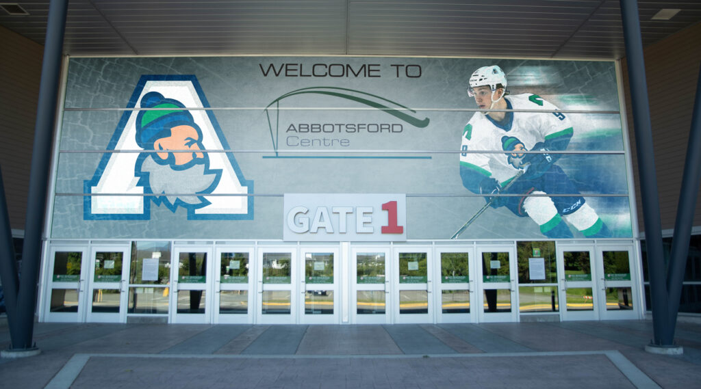
On May 6, 2021, the American Hockey League approved the relocation of the Vancouver Canucks affiliate franchise from Utica, New York to Abbotsford, British Columbia. The move brings professional hockey back to the Fraser Valley after a seven-year absence left by the Abbotsford Heat.
Over the course of five seasons as tenants of the 7,000-seat brand-new Abbotsford Centre arena, the Heat failed to capture the hearts of local fans due in large part to an association with the Canucks’ arch-rival Calgary Flames.
Not only was the team stocked with future enemies of Vancouver diehards, but the franchise leaned into the Flames brand with Calgary-inspired uniforms and a name/logo that was a spark off the old match.
But they were in an uphill battle from the start. The Canucks brand is incredibly strong across the entire province. Despite having Vancouver in their name, the Canucks are truly BC’s team.
Which is why the new franchise shouldn’t get too creative with their new identity.
While I love unique and original branding for farm teams and roll my eyes alongside the rest of you when a team like the Bridgeport Sound Tigers downgrades to sharing its name with their parent club, to get BC fans on board, there’s no better choice than the Abbotsford Canucks.
There was an influx of great concepts by awesome designers that flooded the internet after the Utica-relocation that centred around Abbotsford’s ties to aviation. But any Jet-like iconography just won’t fly in this neck of the woods.
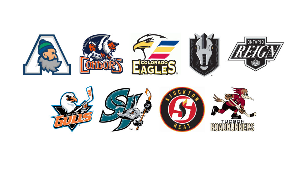
The trend in the AHL over the past decade has been to have nicknames be a spin-off of their NHL affiliates — the Ontario Reign, the San Diego Gulls, the Henderson Silver Knights are all great examples of connecting with their parent in a unique way.
The Canucks name is tricky though. It’s a bit of an abstract term. Sure, you could go with something based on the whale logo, but that doesn’t make a lot of sense for landlocked Abbotsford.
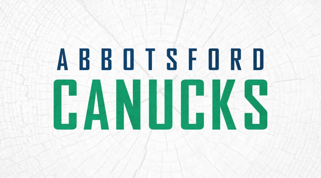
So why not just go with Canucks? Throw some water on the fire of the Abbotsford Heat and use the name that already has a foothold in the region.
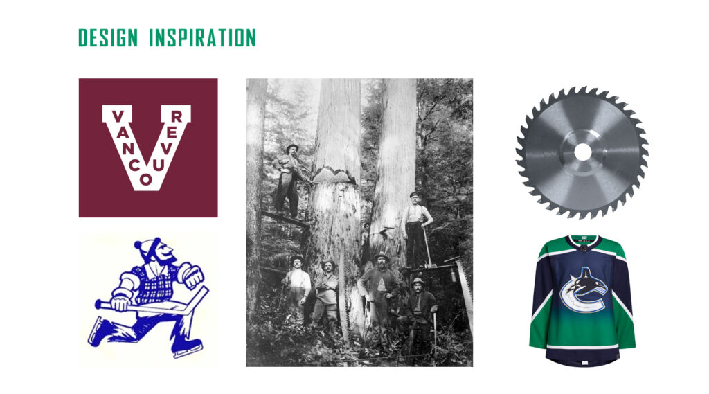
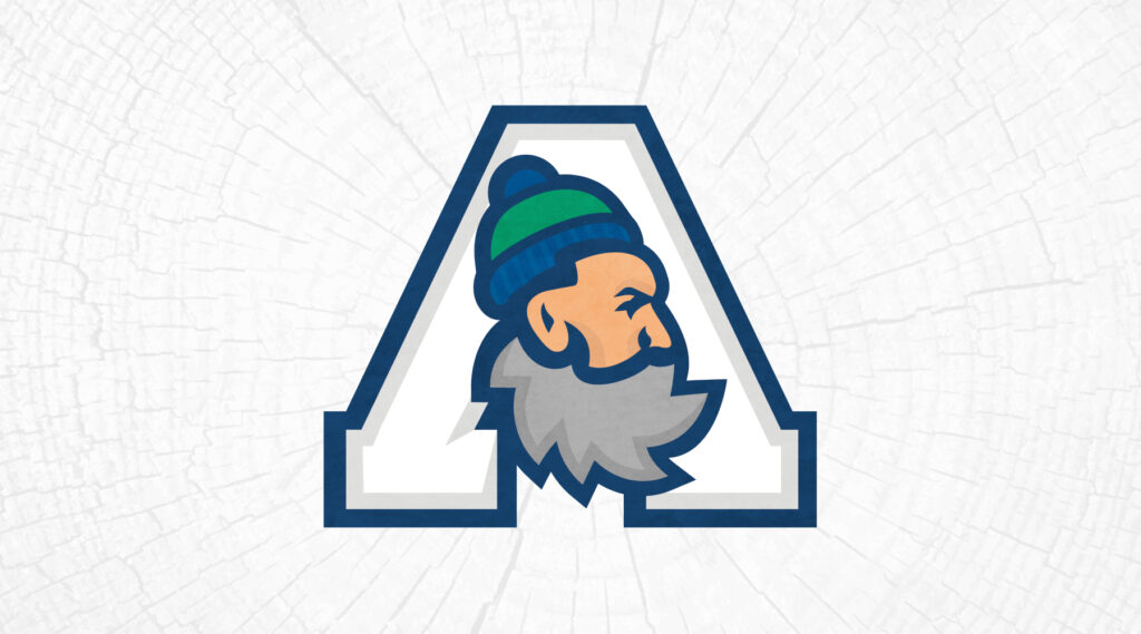
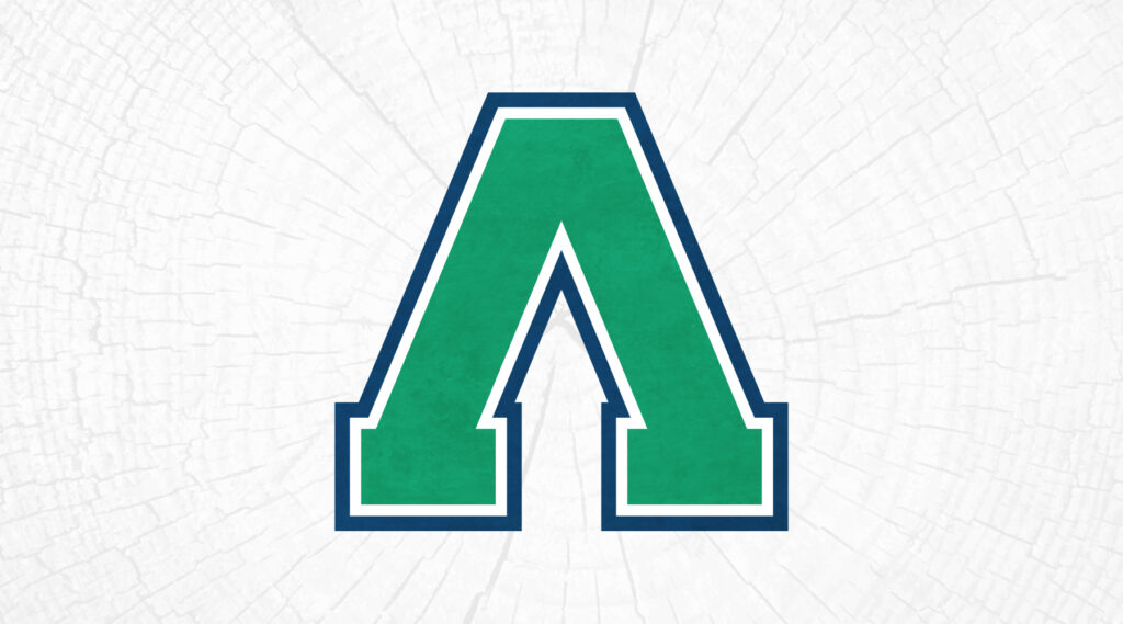
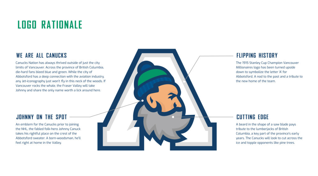
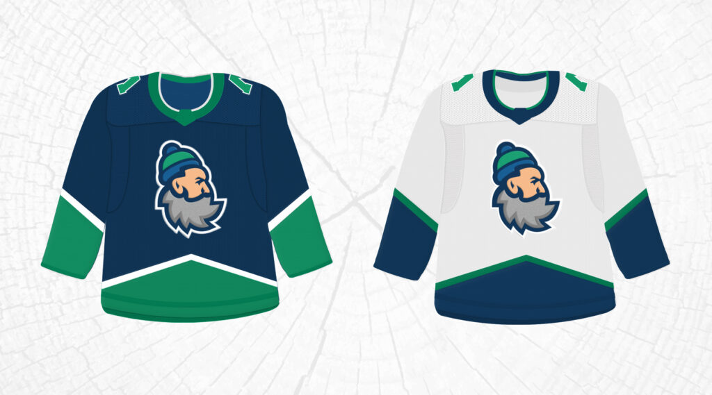
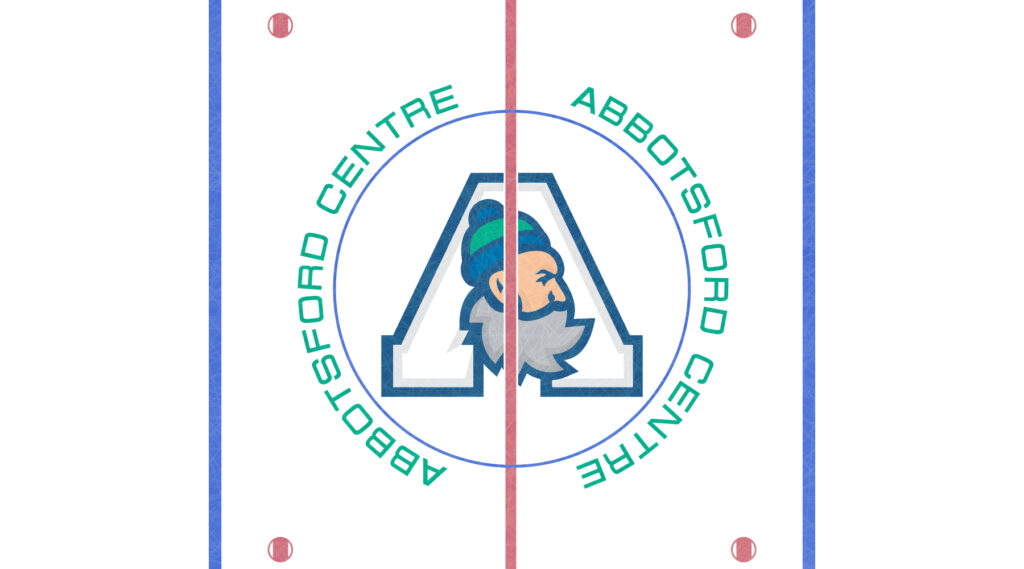
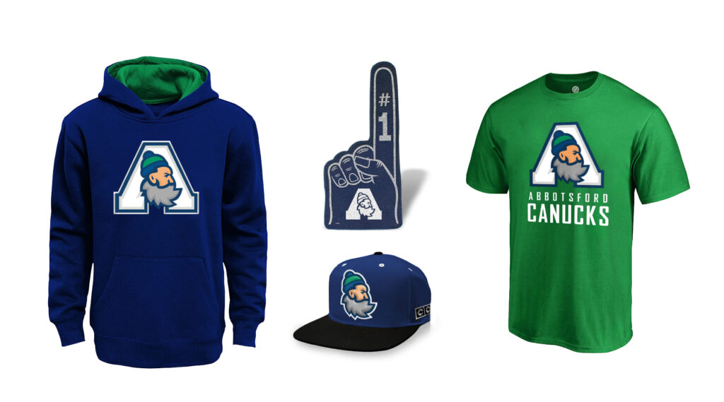
Since the Vancouver club has decided to stick with the orca primary logo and Fin as the mascot, Abbotsford should take full advantage of the relatively dormant Johnny Canuck icon and lumberjack imagery.
This is an original concept design that outfits the new Abbotsford AHL franchise as the Canucks with a strong connection to their NHL parent but a new spin on Johnny and some other classic Vancouver hockey symbols.

Love this idea! Very creative and innovative! Great job Brad!