![]()
I originally wrote this article on the history of the ‘flying skate logo’ in January 2016, but wasn’t able to find anywhere to publish it at the time. With the news of its design being essentially ‘stolen’ by high-end Italian clothing company Versace in September 2017, I thought it might be an interesting time to release it. I made a few changes but the heart of the article is the same. It includes quotes from an interview I did with the logo’s designer, Mike Bull.
“Hockey is such a fast moving sport [and] the logo they had before was so quiet and still, it didn’t seem to exemplify what hockey is all about.”
Mike Bull isn’t really a big hockey fan. He isn’t from Vancouver and he couldn’t name a single player on the Canucks. But without him, one of the most iconic looks in team history wouldn’t exist.
Back in February of 2016, the Canucks wore throwback uniforms to celebrate their 20th season at what is now called Rogers Arena. While most fans are probably swept back to the 1990s when they look at the black-red-and-yellow sweaters, the logo on the crest — designed by Bull — has an even deeper history.
The ‘flying skate’ logo in action on the Canucks’ throwback jerseys on February 13, 2016.
While now synonymous with names like Linden, Bure, and McLean, the skate logo, which has earned nicknames like ‘the plate of spaghetti’ and ‘the waffle iron’, was originally the tamest part of one of the wildest looks in sports history.
Following a disappointing 1977-78 season, in which the Canucks finished third in the Smythe division and missed the playoffs for a second straight year, team president Bill Hughes spent $100,000 to revamp the team’s look.
No, they didn’t sign a star player, the Canucks recruited Beyl & Boyd, a San Francisco based communications firm to give them a new logo and uniforms.
According to Vancouver Sun sports columnist Jim Taylor, Ernie Boyd, the man most responsible for the new design, had never seen a hockey game, but based on research involving “color psychologists” found that the Canuck’s blue and green scheme was too tranquil for such a fast-paced sport.
So they replaced it with black, red-orange and yellow and put massive diagonal lines, which formed a ‘V’ for Vancouver, on the front of their sweaters.
The feedback on the new look was immediately split. Some fans hated it and others despised it. But it was the new crest that was its saving grace.
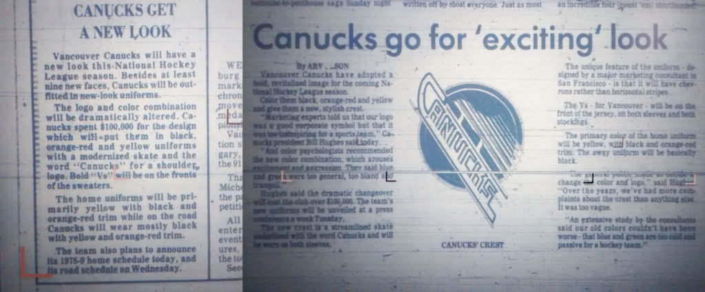
Local media reports after the unveiling of the new logo. They weren’t sure which way to tilt it, at first.
Overshadowed by the loud colours and bold design of the uniforms, the new Canucks logo was first found on the arms of the infamous ‘Flying V’ jerseys. To come up with the mark, Beyl & Boyd solicited submissions from up to 20 illustrators who presented different approaches.
The winner came from a freelance San Franciscan graphic artist named Mike Bull who, after doing some work for Beyl & Boyd for the San Francisco Giants baseball team, a gig that got him season’s tickets behind first base at Candlestick Park, was given the opportunity to take a crack at the Canucks new logo.
While Bull does not recall much about the process, he said he remembers the idea was always to centre the design around skates.
“[A skate design] was always the orientation. I think I just decided it was more dramatic to have the skates on the diagonal,” Bull explained. “It gives more of a feeling of speed and that’s why there are multiple lines and things like that.”
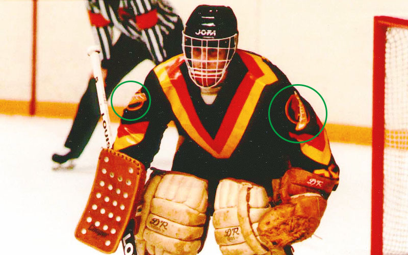
The logo originally appeared on the arms of the infamous ‘flying V’ jerseys.
For Bull, who does not follow sports beyond his hometown Giants, the logo — which is a ‘pop art’ representation of a hockey skate with the word “Canucks” forming the blade — captures what he thinks hockey is about: speed.
“Hockey is a really fast sport and scary in a way. And so I wanted to, as much as possible, to show that without showing total chaos.”
While he has not followed the logo’s progression closely since he finished his winning design, the skate has taken on its own life in the Canucks brand.
Despite the ‘Vs’ trip to the finals in 1982, the outrageous look never captured the hearts of fans in the way the team hoped. In early 1985, as a result of never ending complaints from fans about the way the team dressed, modifications were announced for the ’85-86 season.
Designed by Canucks fan and commercial artist, Glen Green, a resident of North Vancouver (who just happened to be a friend of a friend of then-Canucks president Arthur Griffiths) the new uniforms were a “rehash” of the Flying Vs.
“Word was out that everybody hated those god damned uniforms,” Green recalled. “So as an artist, I just naturally came up with these drawings and got lucky enough to actually show them to the owner.”
Green met up with Griffiths over lunch and showed him some concepts which moved the V pattern to the shoulders and made Bull’s skate logo the new front crest. While Green came up with a white version of the new design as well, and suggested Griffiths use it as the home jersey, the yellow version was selected instead.
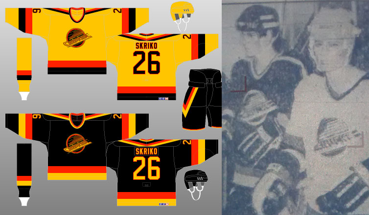
The jerseys designed by Glen Green were the first to utilize the skate as a primary crest.
But lo and behold, in 1989, the Canucks look started to undergo a number of additional changes, beginning with replacing that yellow home sweater with the more traditional white one and removing all ‘V’ imagery. In 1992, the “red-orange” became just “red” and in 1995, the team even introduced a red gradient ‘third jersey’. Throughout this entire time, the skate logo stayed on the chest.
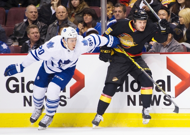
The Canucks had enormous success in the mid-nineties wearing what are now known as the ‘skate jerseys’ and the logo has become synonymous with the epic 1994 Stanley Cup run and all the Canucks legends who wore them. For its designer however, it was just another project, although he does admit it looks pretty sharp.
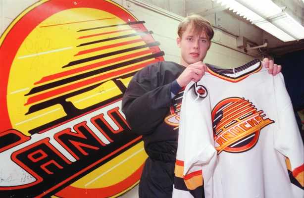
Hall of fame forward Pavel Bure is synonymous with the skate logo.
“I’ve seen it on jerseys and stuff . . . it usually has a black background [and] I think it comes off pretty effectively in colour,” Bull said on the skate’s legacy. “I mean you really notice it.”
While the Canucks retired the ‘skate’ in 1997 with a total redesign that yielded their current Orca logo, there is still a lot of love from fans for the old logo and there was a lot of excitement when it returned two seasons ago. And, while it might make you immediately think of Bure, Linden and McLean, the skate logo is really all Bull.