In 2017-18, the Kootenay ICE will enter an exciting new era — it should come with an updated look.
In their over-20 year history, the ICE have been one of the most successful teams in the WHL, winning the league championship three times (2000, 2002, 2011) and even capturing a Memorial Cup in 2002.
From 1998-2015, Kootenay made the playoffs every year and featured a rotating cast of exciting players including future NHLers like Jarret Stoll, Adam Cracknell, and Sam Reinhart.
However, the team has had a rough time in the past few years. The ICE have finished in dead last in the WHL for the past two seasons and have also had their attendance records dip to dangerously low levels.
There were only two big constants in their history prior to this summer: the ownership of the Chynoweth family and their branding.
The team has essentially had the same management since they arrived in Cranbrook, BC in 1998 and they have also had the same logo (and outside of an update due to the new Reebok Edge template in 2009-10, the same uniforms).
With Jeff Chynoweth’s announcement in March that his family had entered into an agreement to sell the team to Winnipeg entrepreneur Greg Fettes and hockey executive Matt Cockell, the club will experience its first major shakeup in 2017.
With next season also being the rookie year for 2016 first overall bantam draft selection Peyton Krebs, there has never been a better time to redo their branding with a look more appropriate to this bold new era of Kootenay Ice hockey.
This is my concept for updated logos, uniforms, and general branding.
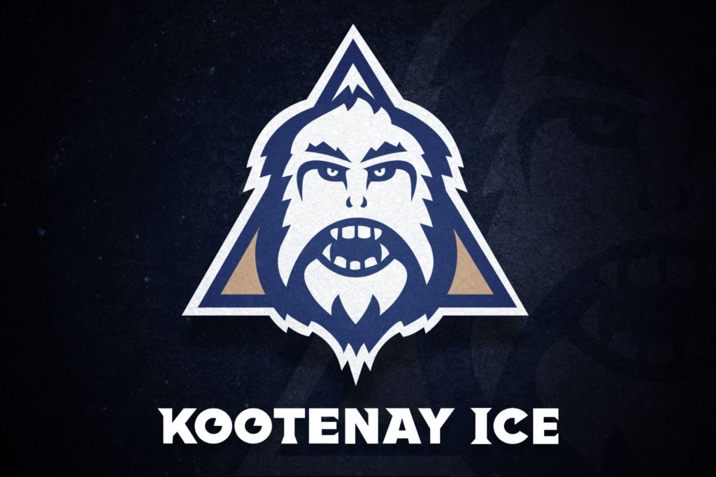
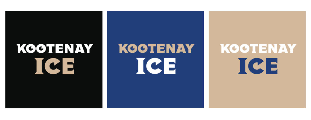
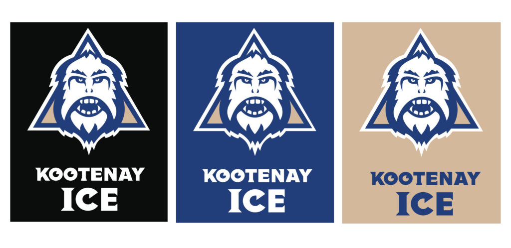
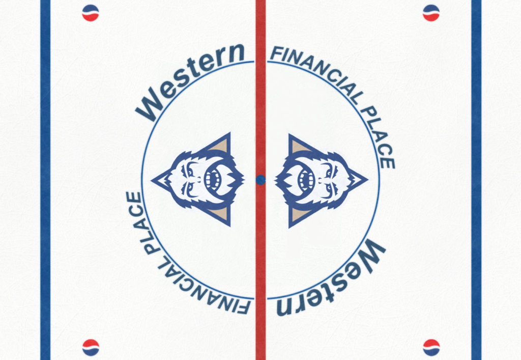
Primary Logo:
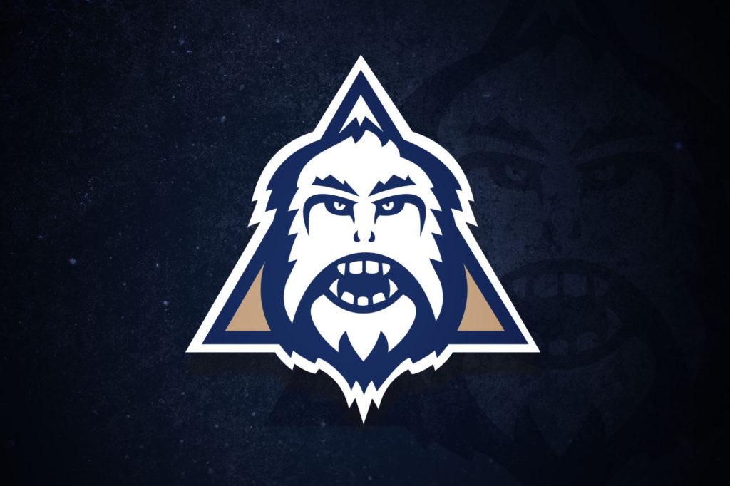
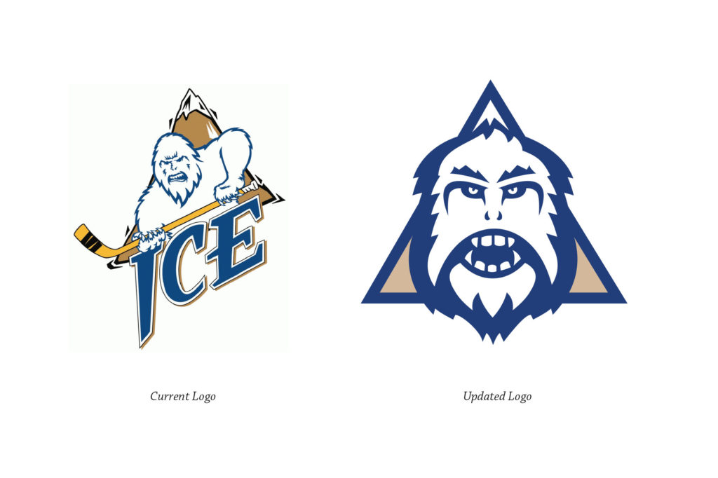
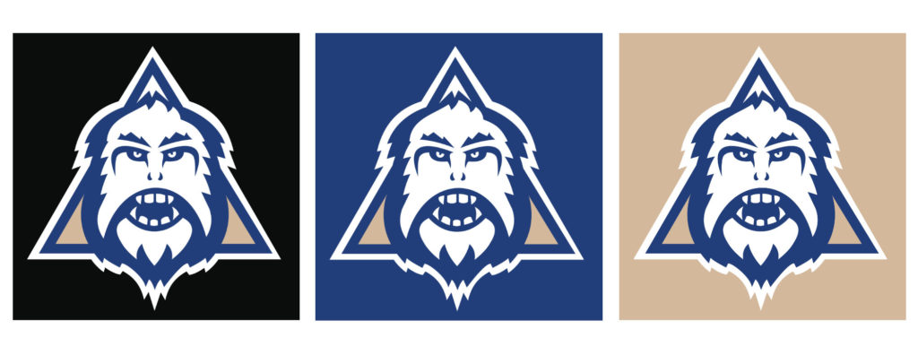
The new logo is a simple take on the classic Kootenay Ice mark that retires some of the 1990s elements in favour of a bolder, more iconic design.
The basic colour scheme and elements remain — in my redesign the ICE are still a black, blue and bronze team featuring a fierce-looking yeti and a mountain — but the new logo ditches the yellow hockey stick and no longer necessary team script.
The new logo is still unmistakably a Kootenay ICE look but updates the team for 2017.
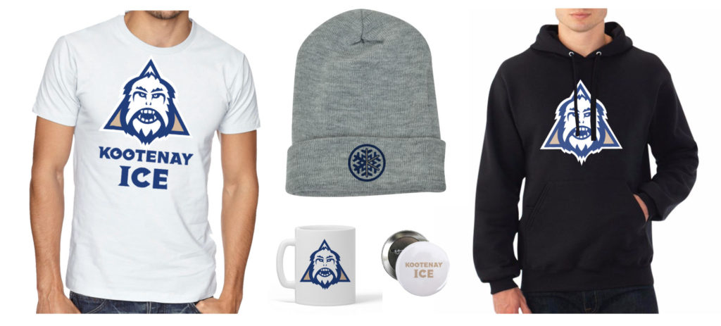
Secondary Logo:

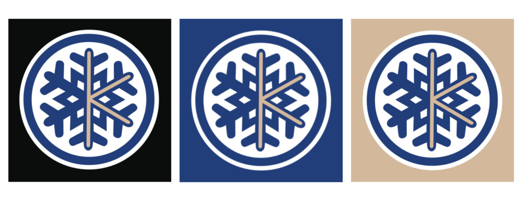
The secondary is a completely new design and is simple on purpose. It’s a snowflake with the letter ‘K’ for Kootenay.
It connects to the ICE name, the Kootenay-region, and works well as a shoulder patch for the uniforms.
Uniforms:
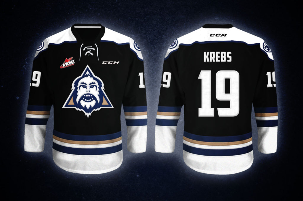
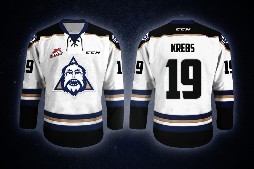
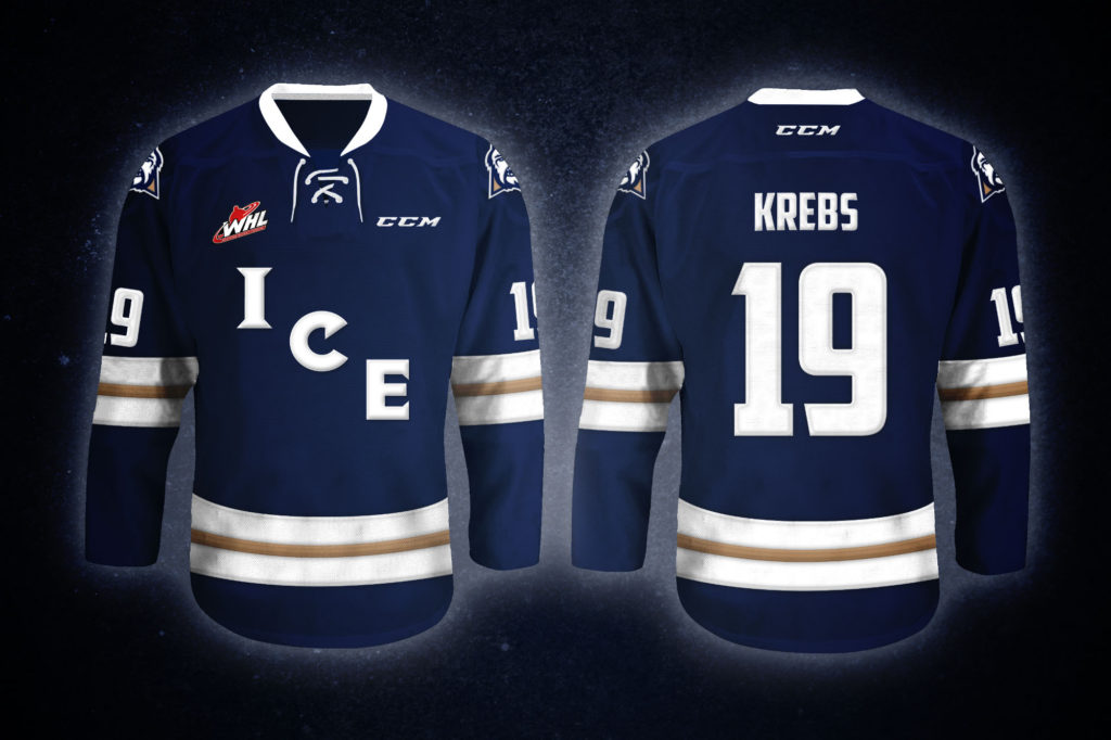
The ICE have never had very original uniform designs. Their inaugural look was just their crest stuck on the Washington Capitals uniforms and their update in 2009 was to a very generic Reebok-edge template.
These new uniform designs are just an attempt to give them their own look. They are loosely based on their most recent alternate jersey, but are mostly just a couple of classic hockey sweaters that are unique without being garish or trapped in a specific era.
Brand
The Kootenay ICE have consistently put out a great product on the ice. They’ve had top-notch players, coaches, and management throughout their entire history. As they’ve learned in the past two years, however, there will be rough times in terms of the standing the standings. A new branding would be one step towards becoming a more engaging franchise win or lose.
The #ANewIceAge hashtag is one small example of how a new brand could be utilized to generate hype and connect fans to this next step in the evolution of the Kootenay Ice hockey club.
A rebrand isn’t the solution to all the franchise’s problems, but a new look would signal a new attitude and could inspire genuine excitement and optimism for the Kootenay Ice.
To contact the creator of this concept, email: braddmcleod@gmail.com.
Some really good work here. The ice should really buy these logos.
Should change the name to the Cranbrook Colts that will bring in more fans. The team plays their home games in Cranbrook and only Cranbrook so to be called the Kootenay Ice does not work.
As a Kootenay Ice fan and season ticket holder, I would embrace this new logo and uniforms. The uniform color scheme looks incredible and that new logo still keeps the traditional Yeti but with a fresh new upgraded look. I would buy a new jersey in a heartbeat. I know many fans who would also welcome this fresh new branding.
Beautiful branding! I love the colours and design – very modern. The only thing I’m not loving is the pure symmetry of the logo. Perhaps making the face asymmetrical (similar to the expression on the face in the current logo) would be more interesting. The secondary logo is great! What an awesome idea to have an alternate design for merchandise. Hope to see your work on the jerseys next year!
Love the new look and especially #new ICE age brand!!! Would love to see a new mascot costume to go with it as the current one is quite old and worn. Many fans hoping to hear of new ticket pricing that is family affordable. I’m really looking forward to next season and seeing the changes that come.. why? It’s a #new ICE age!!
I agree with Glen the throw back nostalgia name would be excellent. Cranbrook Colts
Keeping in mind that I with never forget what Ed Chenoweth and his family have contributed to our hockey heritage here in Cranbrook, I welcome a new vision and image going forward for the future of the Kootenay Ice. I do believe these changes can help provide the boost we as die hard fans see as bringing new and desperately needed support for this team . This is a new Era in for our team and these changes can do nothing but create a new sense of excitement and promise for the future of our hockey team. I think this proposed logo is sharp and is just what is needed for a fresh new exciting start for our hockey teams future here in Cranbrook. Go! Ice GO!