
Seattle is one of the best sports cities in the world.
But while the Seahawks have a Super Bowl championship in the past decade and the Sounders won the MLS Cup in the past five years, the Mariners have been left behind.
With an expansion NHL team coming and the NBA likely following suit, the baseball club needs to find a way to stay in the spotlight.
Although success on the field is no doubt the key to a return to major prominence, a brand refresh could go a long way in competing with the ’12th man’ and new teams.
Logo
The Mariners have used their current logo since 1993 and it shows. The colours are great, but the primary is a little too busy for the current era.
Following the trend of recent branding efforts in the MLB and professional sports in general, my concept mixes the team’s history with modern design elements to create a clean, classic look.
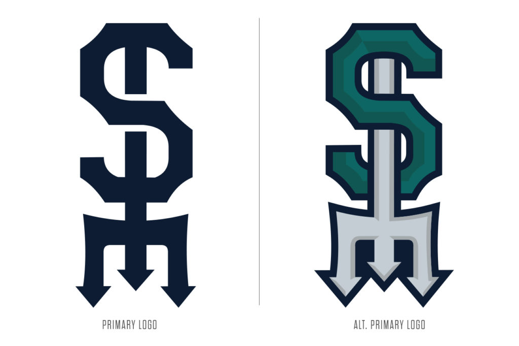
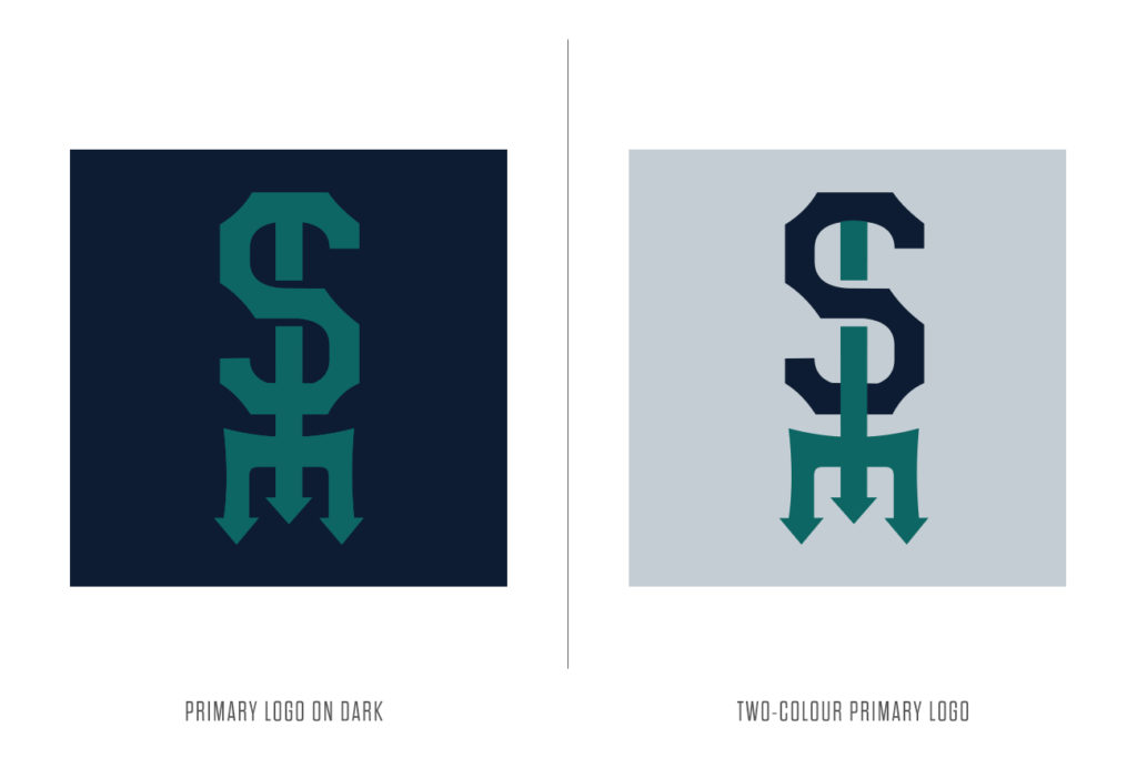
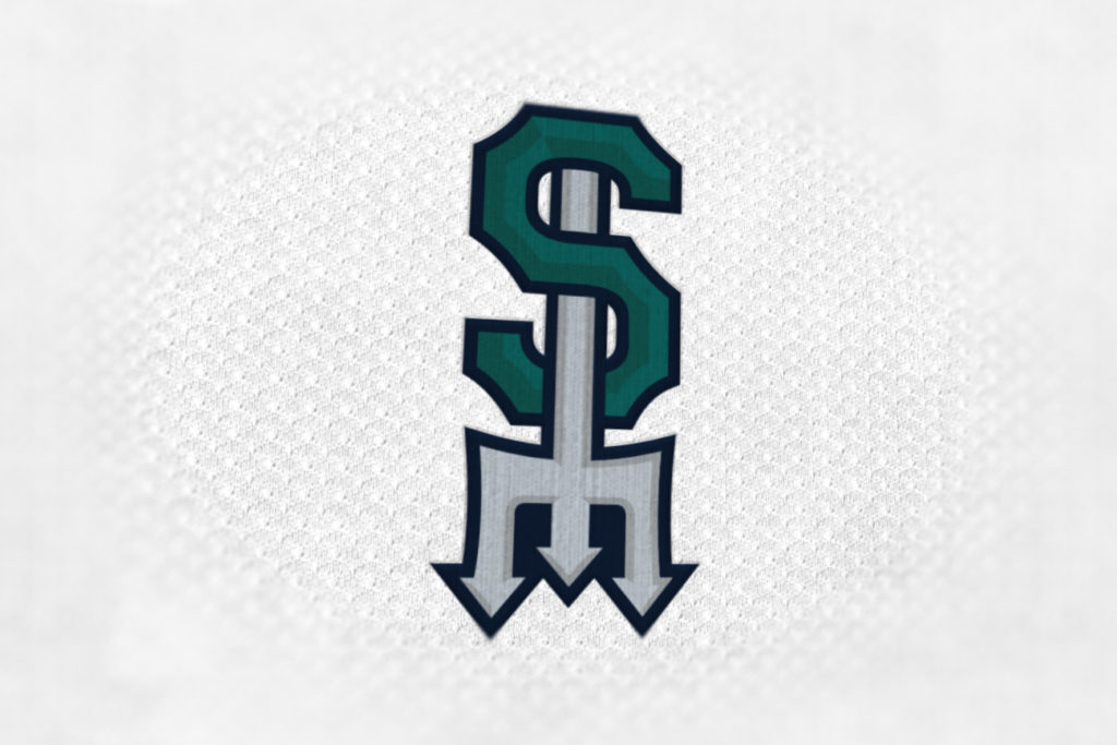
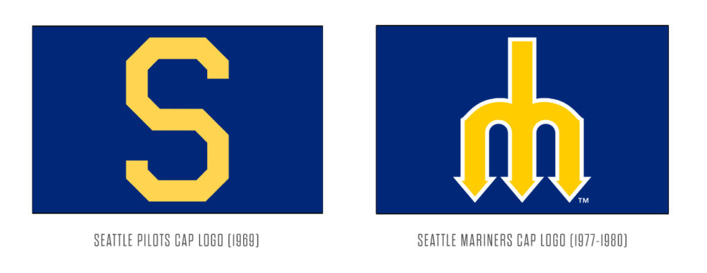
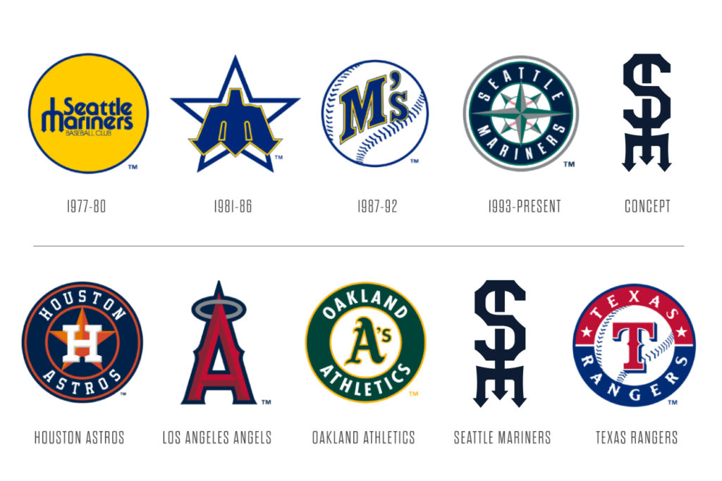
The primary logo is a blend of the ‘S’ mark used by the city’s first major league club, the Seattle Pilots, and the team’s original trident ‘M’ logo. Both logos were stylized to fit together seamlessly, interlocking in a manner reminiscent of a turn-of-the-century baseball team as an homage to the long history of professional baseball in the Emerald City, which dates back to 1903.
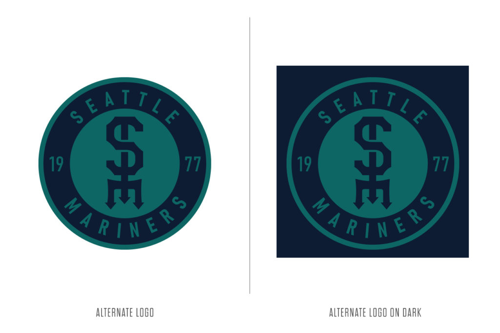
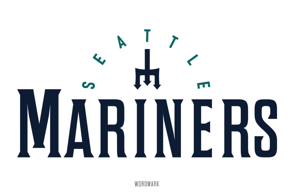
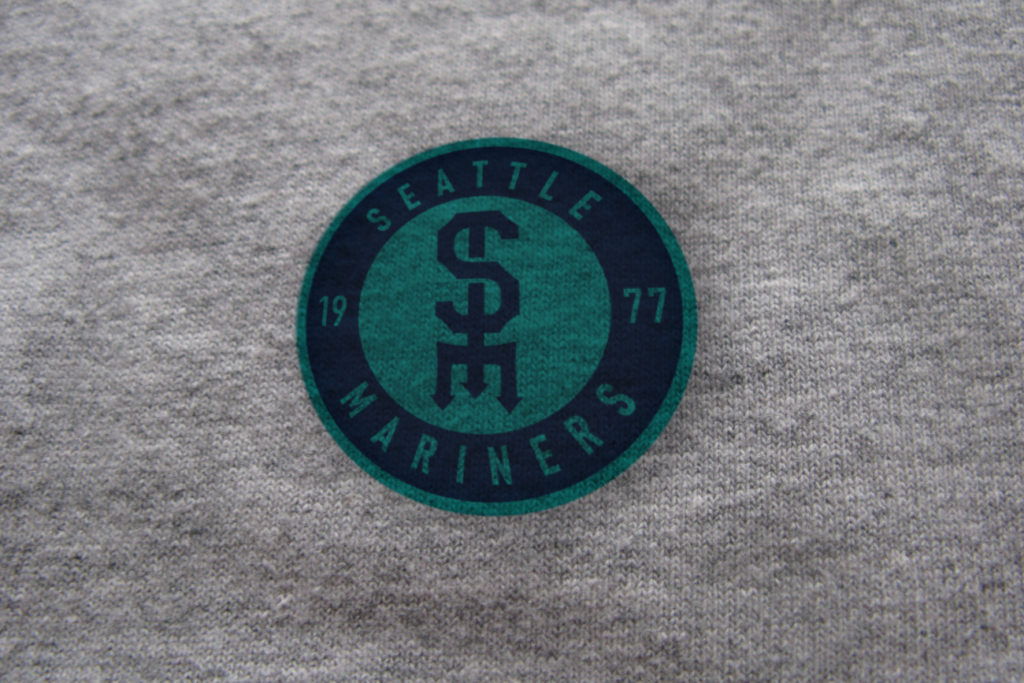
In addition to the simple primary mark, I also created a more modern take on it with dimension and depth to serve as an alternative primary. The logo package also includes a circular logo and a wordmark, key elements to any baseball team’s brand.
Here’s how the new logo would fit into the team’s timeline and in comparison to their AL West division rivals.
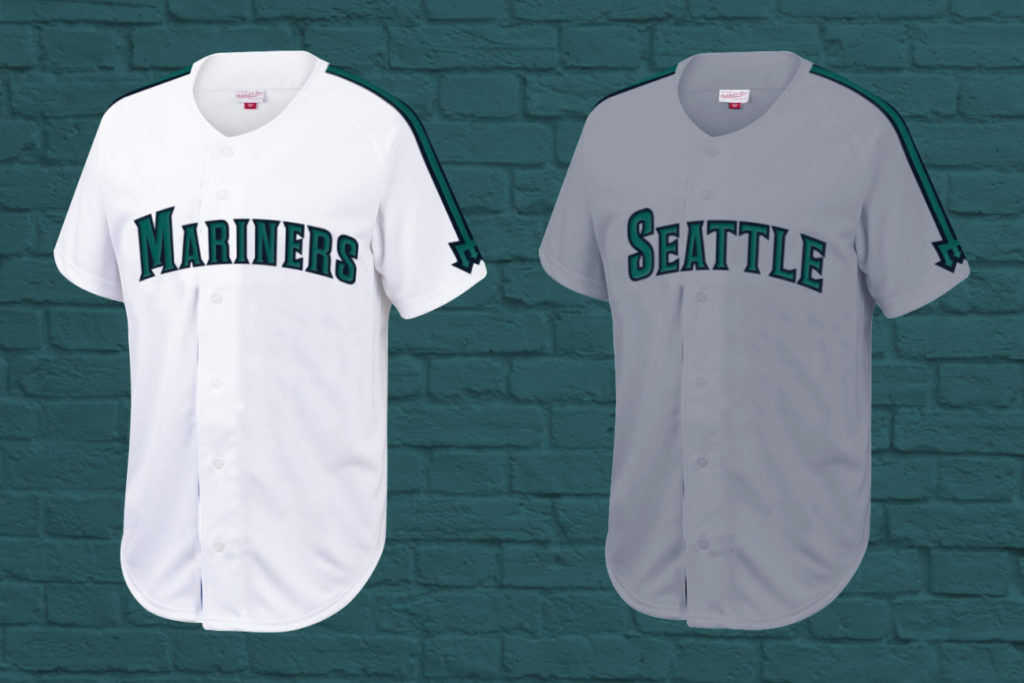
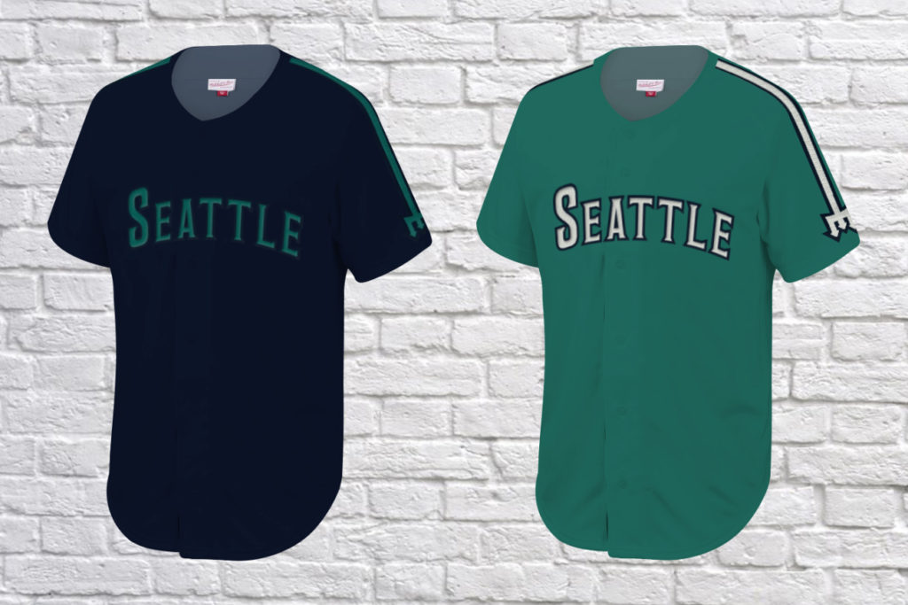
Uniforms
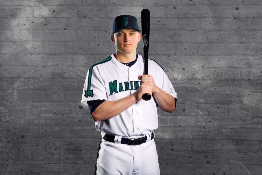
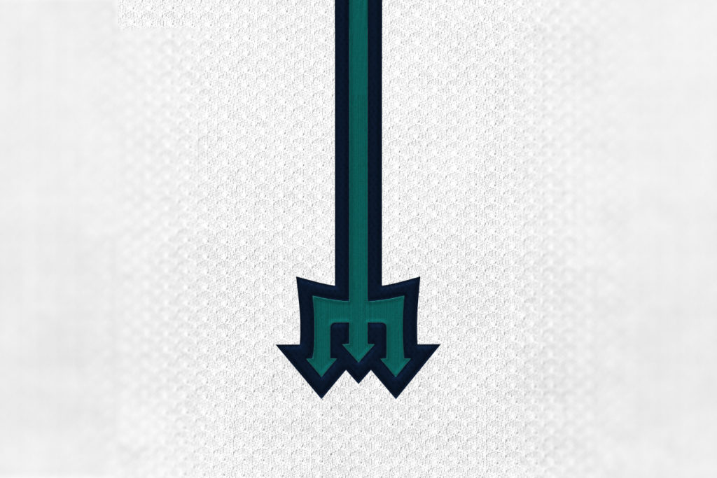
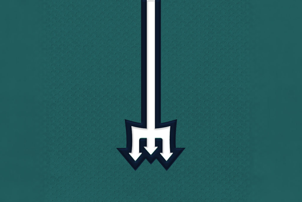
Bringing back the trident ‘M’ was a major focus in my redesign. Their original mark and most clever logo to date, with some updating it fits perfectly in the current sports aesthetics landscape.
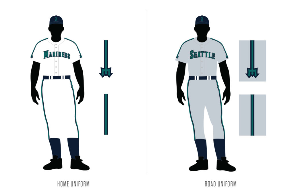
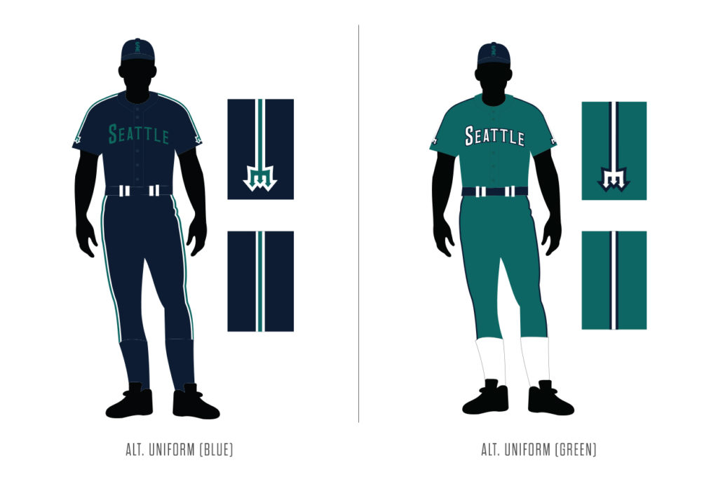
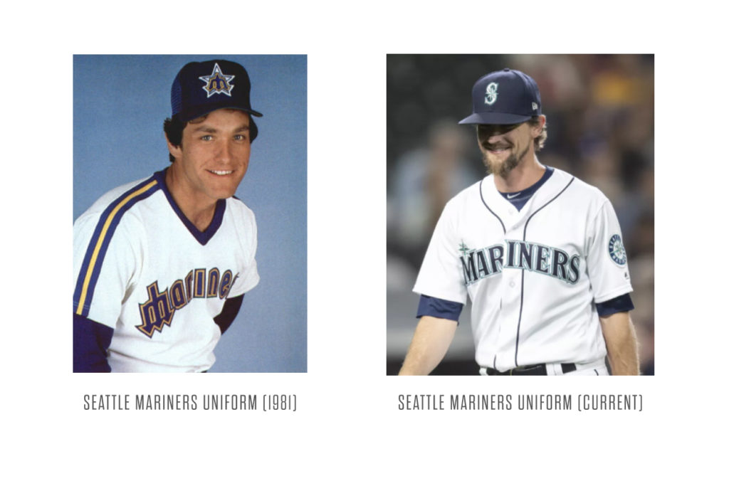
Simple jerseys based on the team’s 1981-1986 look, the new uniforms retain the current pacific northwest colour scheme and have three shoulder-to-sleeve stripes forming the trident ‘M’ on the arms.
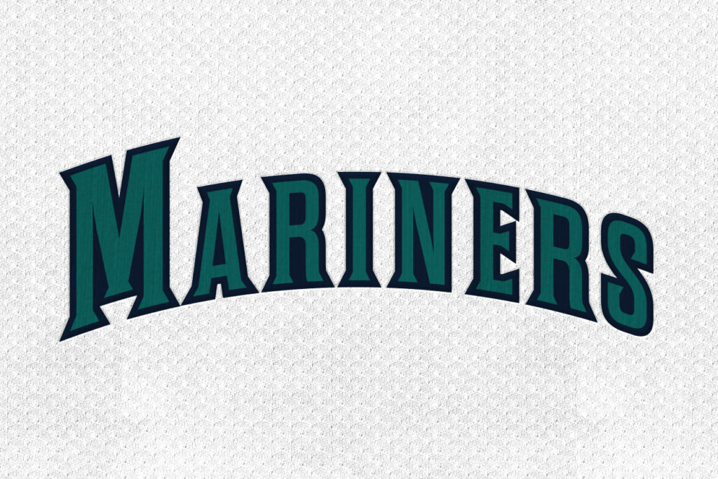
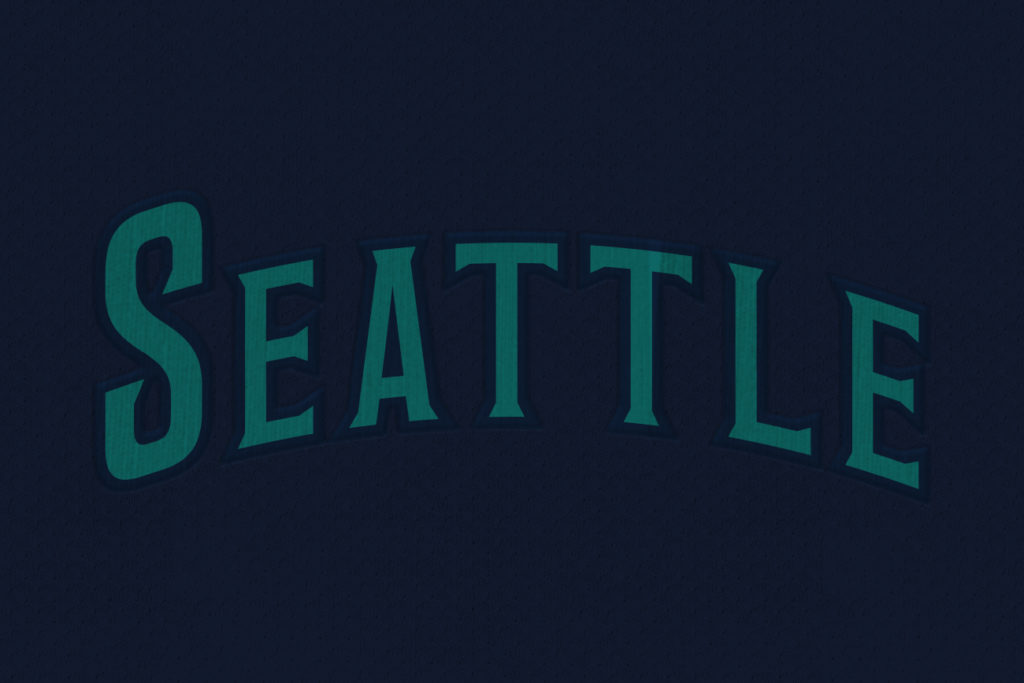
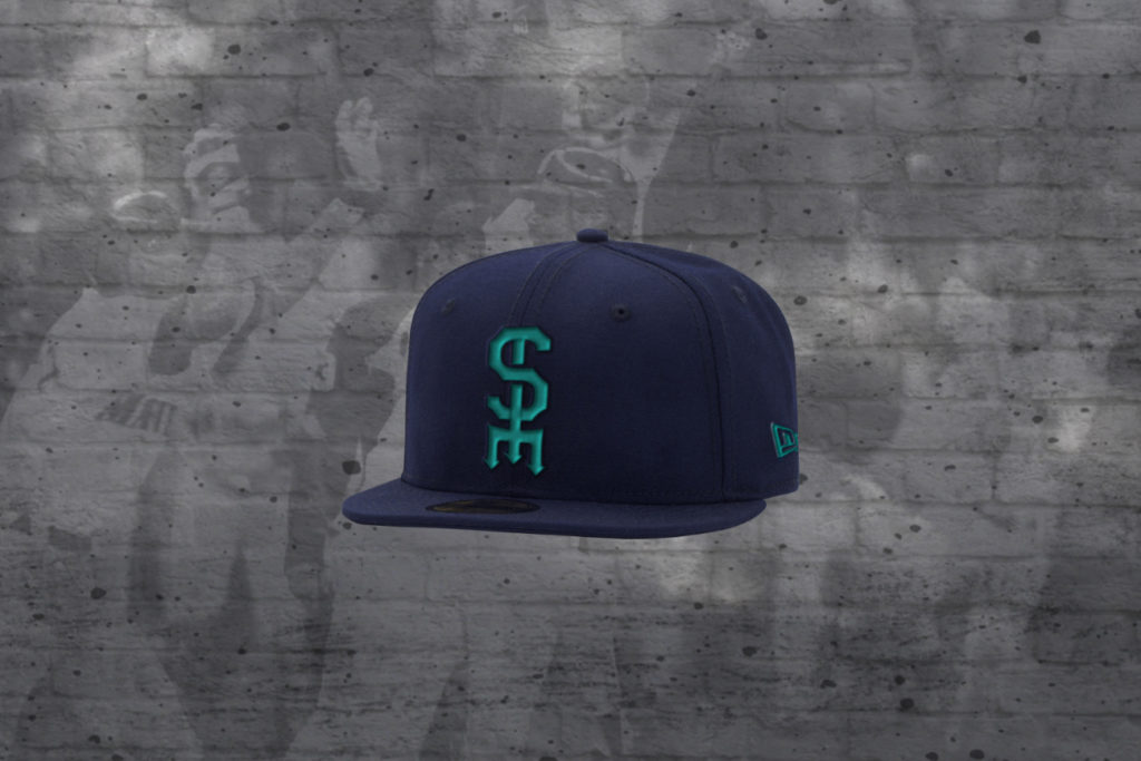
The cap design is a simple two-tone look, with bright green taking centre stage as a connection to the bold uniforms of the Seahawks and Sounders. The jersey scripts are a simplified version of the team’s current look, eliminating some of the cluttering outlines.
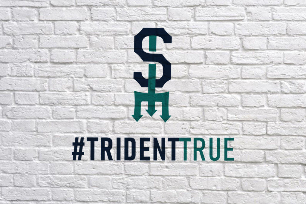
Slogan: #TridentTrue
In today’s sports world, a solid hashtag is an essential part of a rebranding effort. To highlight the new look and the return of an ‘M’ in the M’s look, #TridentTrue is a slogan for the rebrand. The ‘M’ trident has stood the test of time and is the perfect logo to bring the Mariners into the next era. It’s tried and true.
Your concept is great! Slick, sharp, devoid of clutter. A very recognizable logo, brought into the twenty-first century!
Great concept! The simplified scripts and sleeve stripes are really nice. The one fatal flaw is the dark shade teal—this is the same problem with the actual Mariners uniforms. There isn’t enough contrast between the navy and teal. Go with a brighter shade of teal (something closer to the original Marlins) and it would make a huge difference!