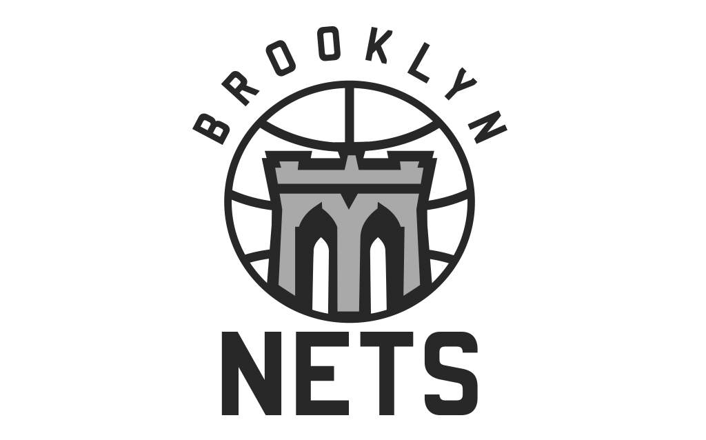
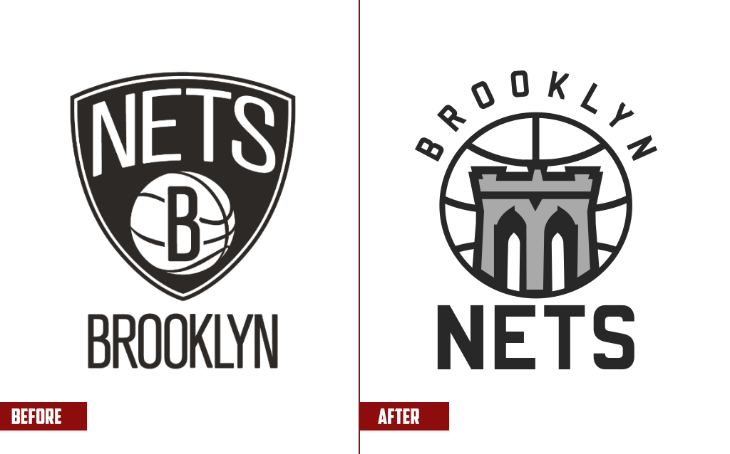
I’ve always thought that the Brooklyn Nets have one of the coolest brands in the NBA, but as they approach their eighth season, a refresh might be necessary sometime soon. For this concept, I created logos and a look that keeps the simple, iconic Nets feel, but adds a little more regional flair and creative design.
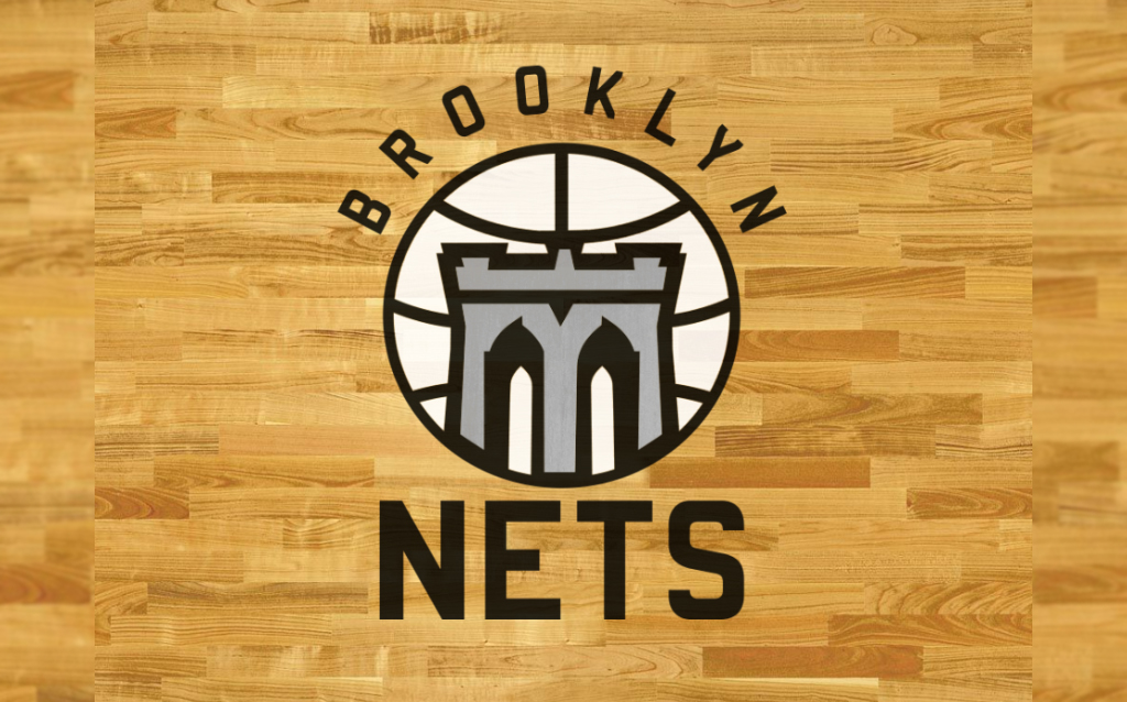
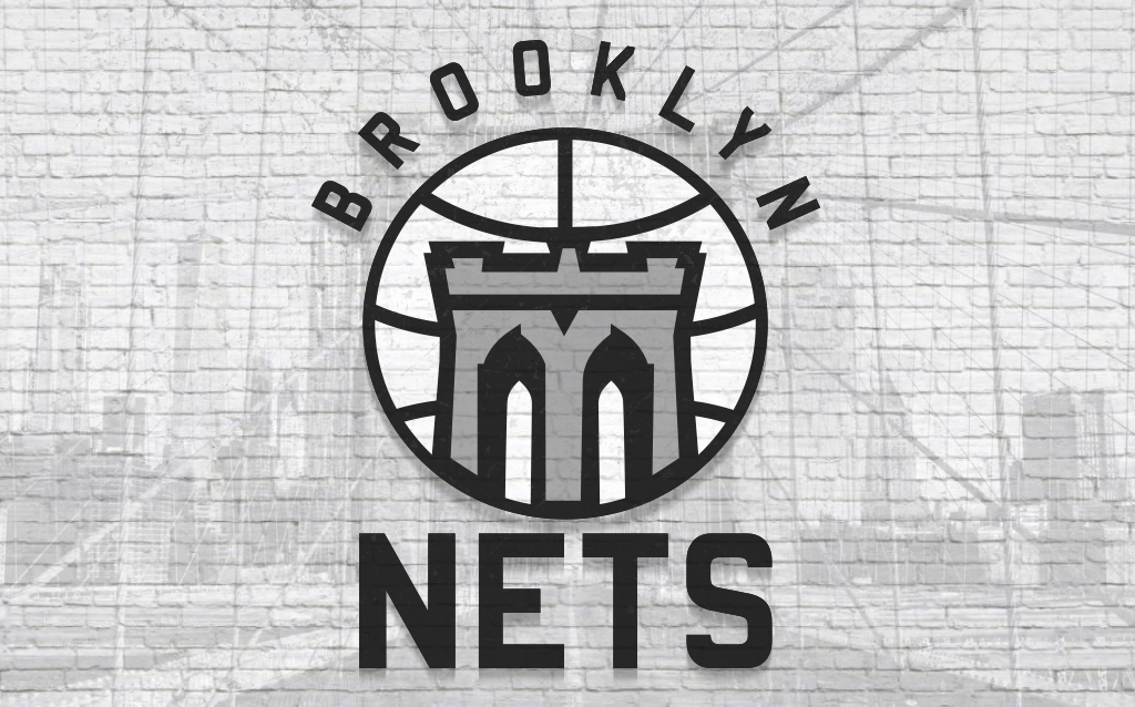
For the new primary logo, the design is centred around the famous tower of the Brooklyn Bridge with the cables that support it forming the basketball lines on a circle. The gateway from Manhattan to Brooklyn since 1883, the bridge is a historic symbol of the borough, an instantly recognizable icon to the rest of the league and the world.
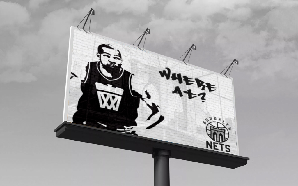
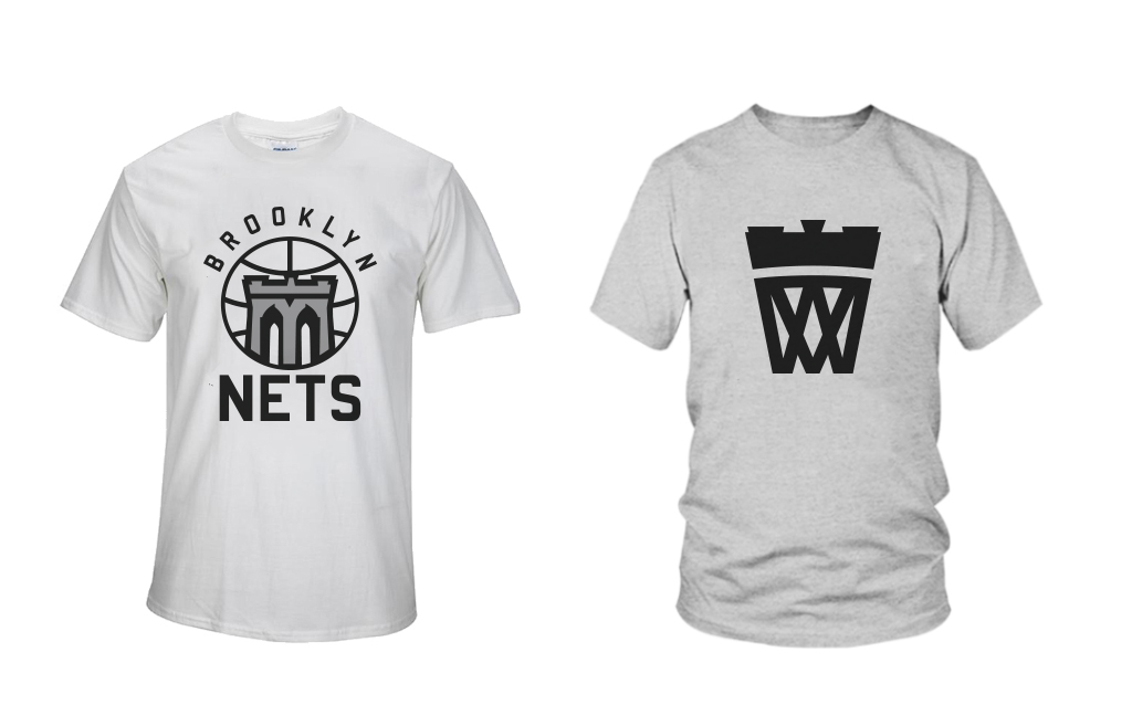
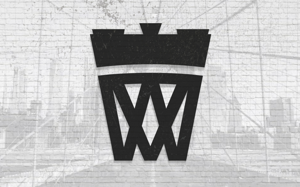
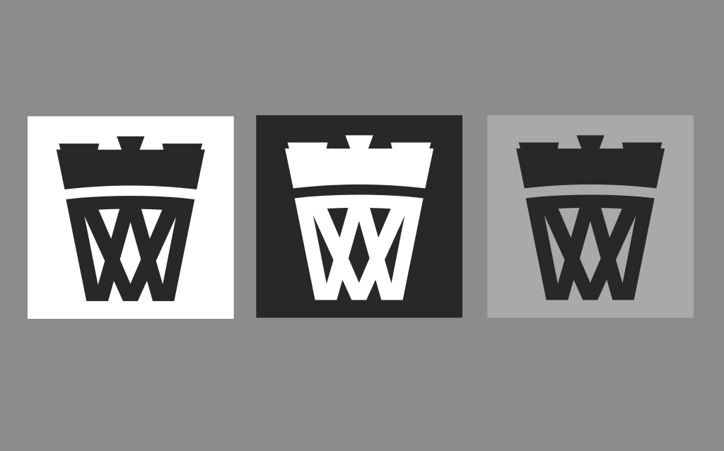
The secondary logo follows the same motif, with the bridge tower placed overtop of a design element which has, somehow never been used by this franchise, a net. It’s a simple bold mark, that is ‘Brooklyn cool’ and ties the city and team nickname together seamlessly.
The final piece of this rebrand is the uniforms. I kept the concept simple, like the team’s current uniforms, but was inspired by the city’s subway signs for the short stripe design and the bold yellow circle numbers.
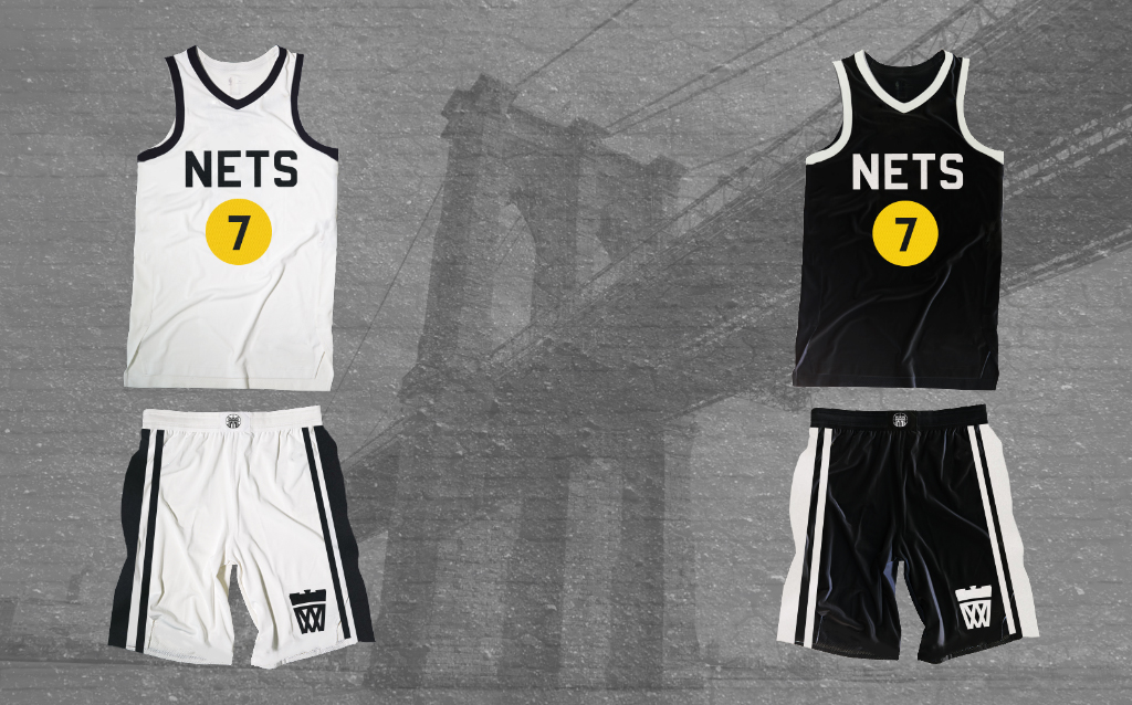
Here’s a little look at how this new Nets brand could look out in the wild.