Beginning over the summer of 2022, I was given the opportunity to refresh the visual brand of the Saskatchewan Rush Lacrosse Club.
Founded in 2005 as the Edmonton Rush, the franchise relocated to Saskatoon, Saskatchewan in 2015 and is one of the most successful and popular teams in the National Lacrosse League with five NLL Cup finals appearances and championships in 2015, 2016, and 2018.
Having changed ownership prior to the 2021-22 season, the club was looking to update their identity and I was tasked with leading the development of new logos, uniforms, and their visual brand.
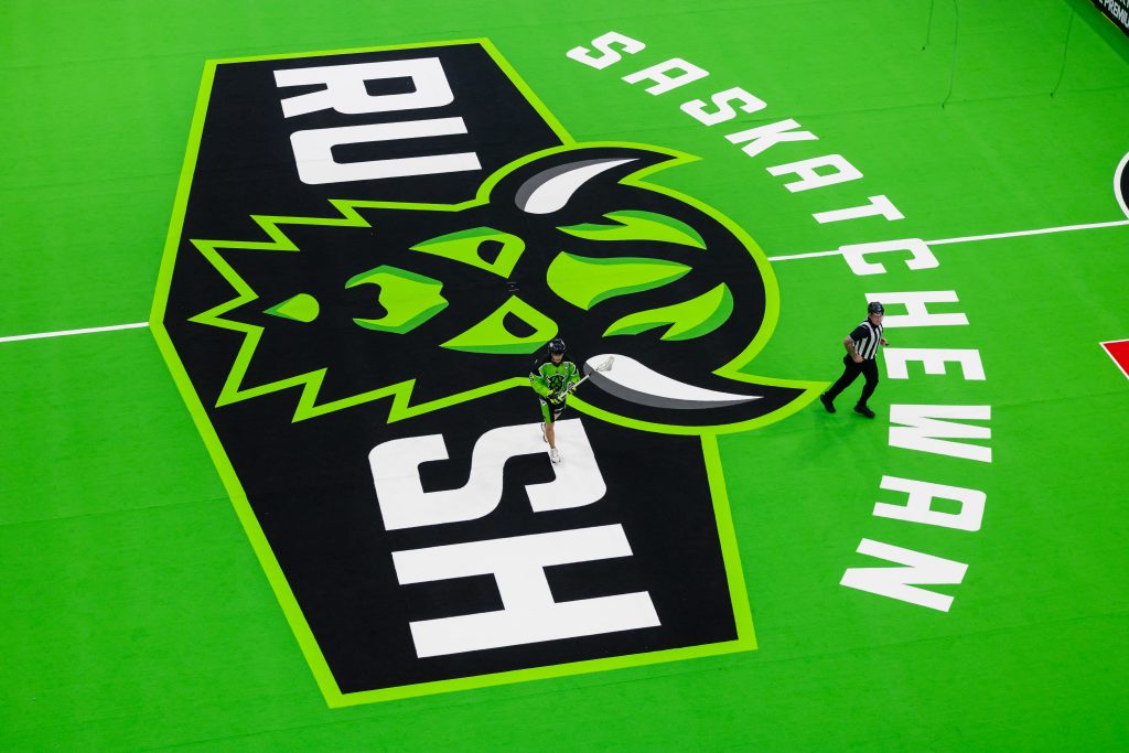
The organization’s management team was interested in replacing what they felt was a dated looking wordmark design that had been used since the team’s inception in Edmonton, with something more iconic and bold. The objectives given to me were to create a logo which defined what ‘Rush’ meant in a less abstract way, pay homage to the team’s home province and the sport of lacrosse, all while keeping the club’s existing colour scheme and edge.
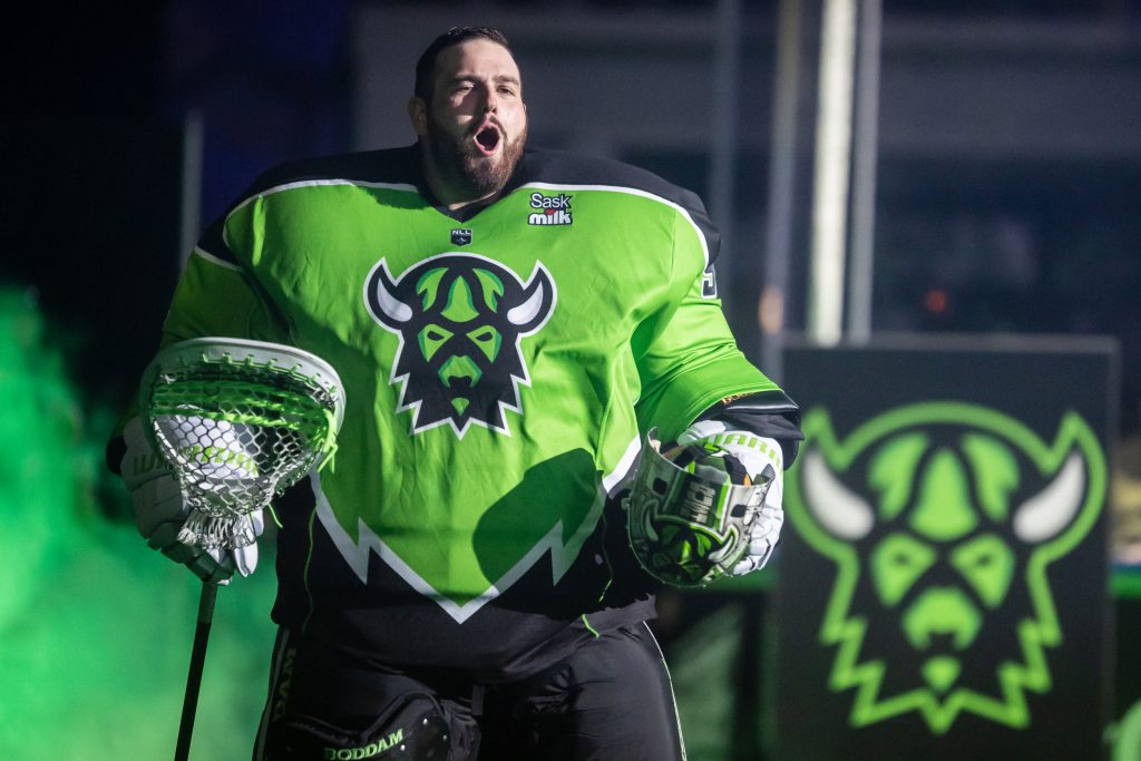
My first pitch was for a logo centered around a bison head, as the animal has a strong connection to the Canadian prairies and Saskatchewan, and symbolizes “Rush” in its fast and powerful movements.
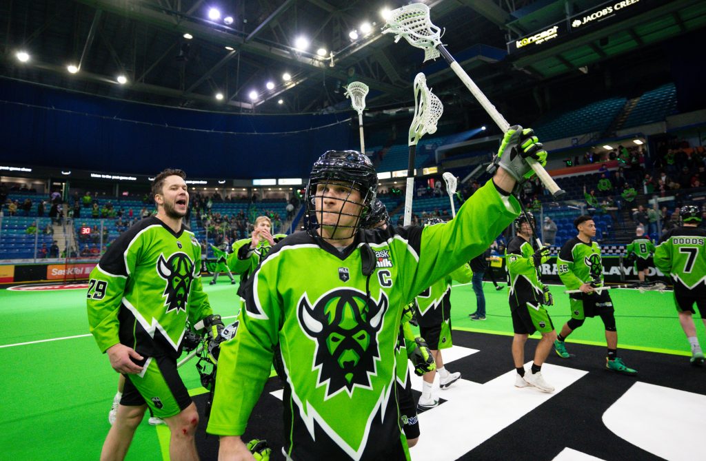
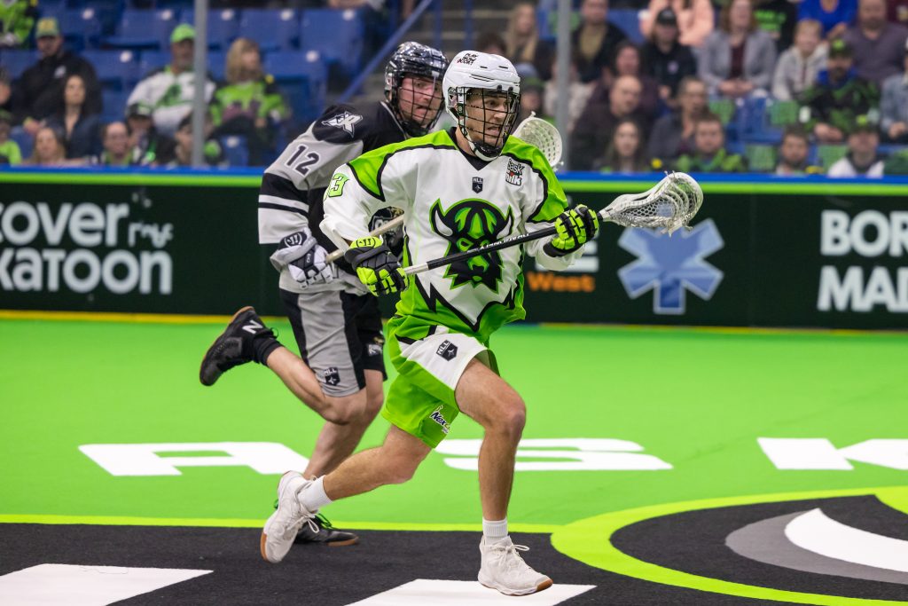
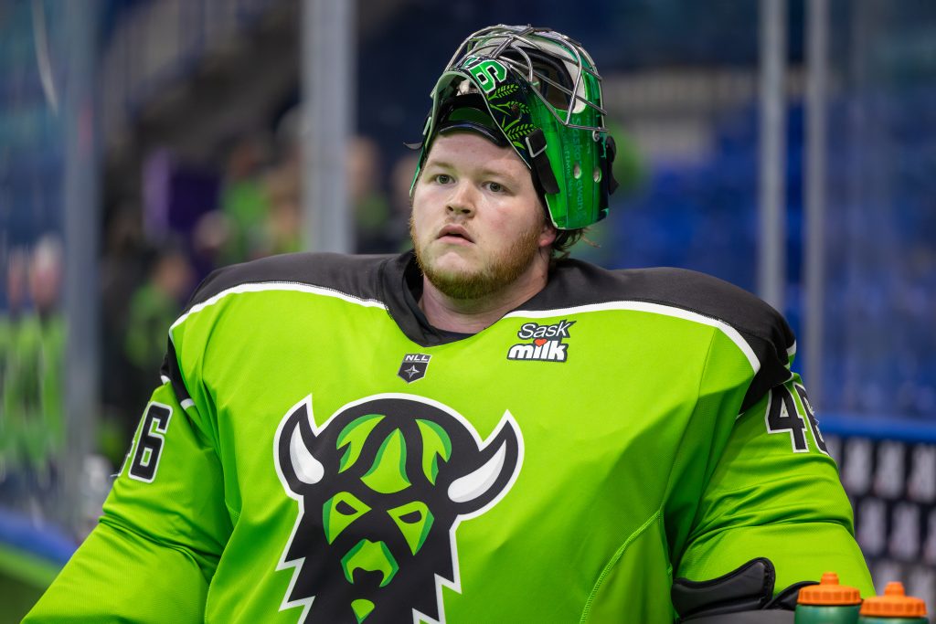
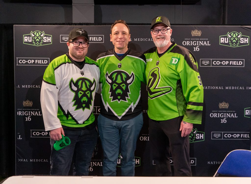
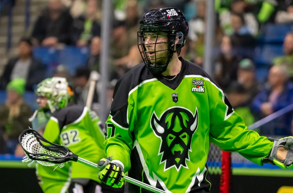
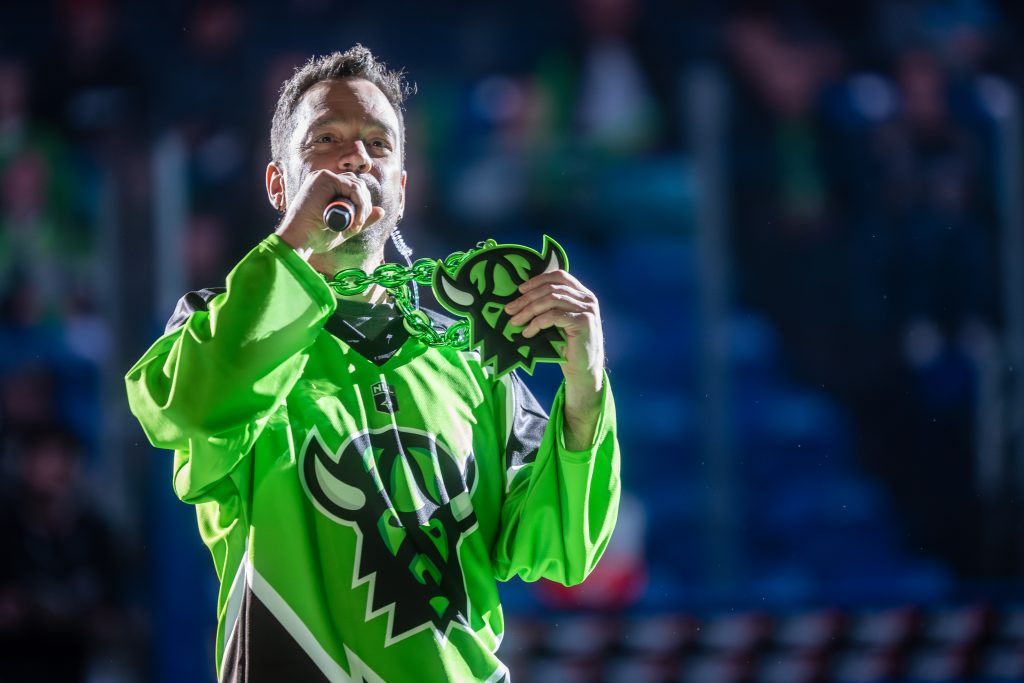
After working on several different designs and iterating the logo through feedback and collaboration with the team’s management including the business manager, brand manager, and team owner, the final design was approved and took over as the team’s new primary mark for the 2023-24 season.
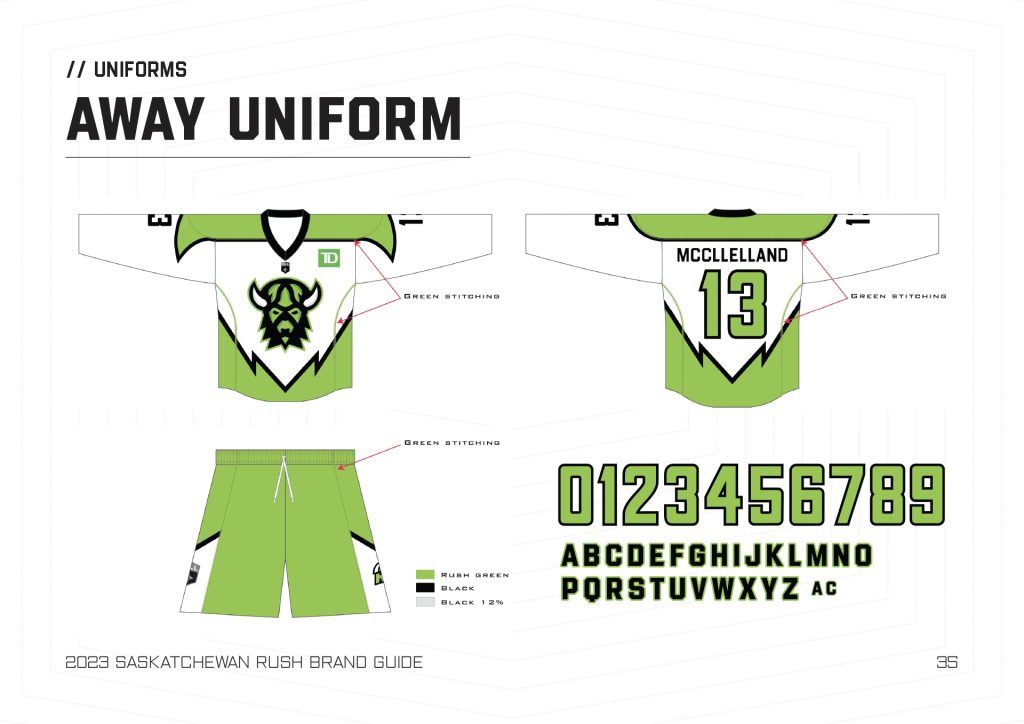
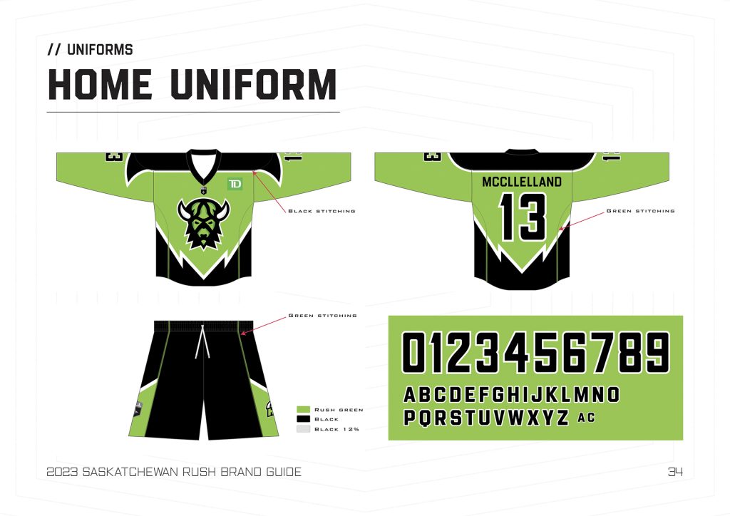
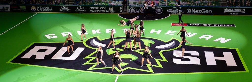
In addition to the primary logo, I also designed secondary marks, uniforms, a comprehensive brand guide, and many more visual assets.