This past year, Simon Fraser University celebrated its 50th anniversary. While the school is largely known for its radical roots, it is also notable for its athletics program which has achieved a lot of success and blazed a unique path in its half-century of existence.
Despite being located in Burnaby, British Columbia, Canada, SFU has always aimed to compete as an American university when it comes to sports and it is currently the only post-secondary institution in Canada that is a member of the NCAA (in Division II). Beginning in 1965, and excluding a brief run from 2002-2009, SFU has also always played American football, another unique quality of the ‘Clan’ athletic program.
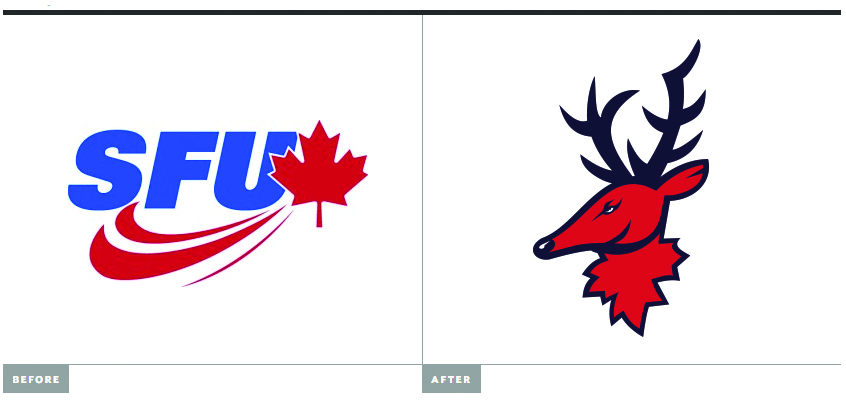
The 50th anniversary is the perfect time for a Simon Fraser University Clan rebrand and my design would be a bold, new look!
The deer with a mighty Canadian crest has elements of the past (from the recently departed Lorne Davies to their Fraser Clan forefathers), yet also looks toward the future. If you take a look at SFU’s recent men’s basketball and football records, you’ll understand why now, more than ever, is a great opportunity for change. This could be the saviour for Simon Fraser, both on the field and at the student store.
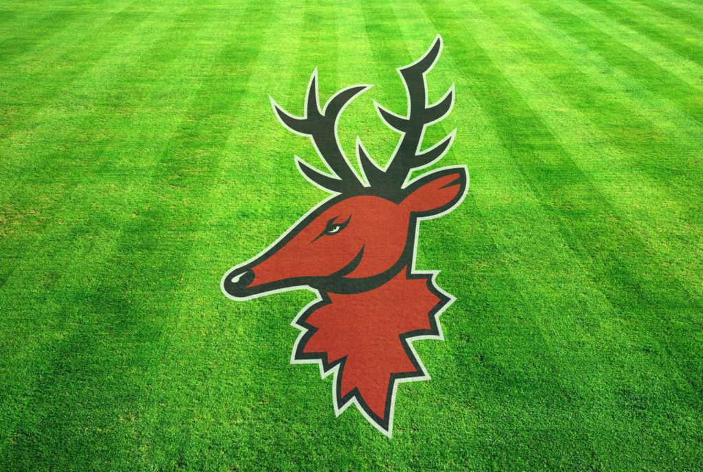
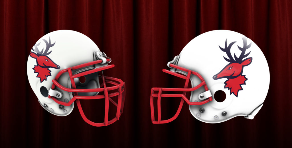
The logo is primarily a combination of two elements: the side profile of a stoic buck and the maple leaf which represents Canada.
The deer was not chosen randomly. SFU is named in honour of the Scottish explorer, Simon Fraser, who discovered the nearby Fraser River. The Highland clan ‘Fraser of Lovat’, to which Simon belonged, have a crest with a side profile of a buck’s head prominently displayed. This logo, a representation of that symbol, is displayed in Lorne Davies’ classic colours. If this explanation isn’t satisfactory enough, deer are also a familiar sight on Burnaby campus, and are definitely a more distinguished animal than some of the school’s other creatures.
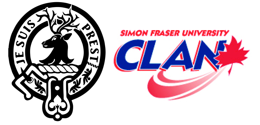
The maple leaf, the remaining link tying together SFU’s logo lineage, is cleverly incorporated into the deer’s crest, as a nod to SFU being the only Canadian university among their competition. As an element of the logo and not the centerpiece however, the Clan maintains its own identity.
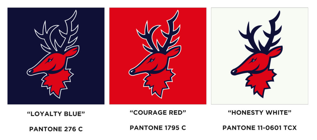
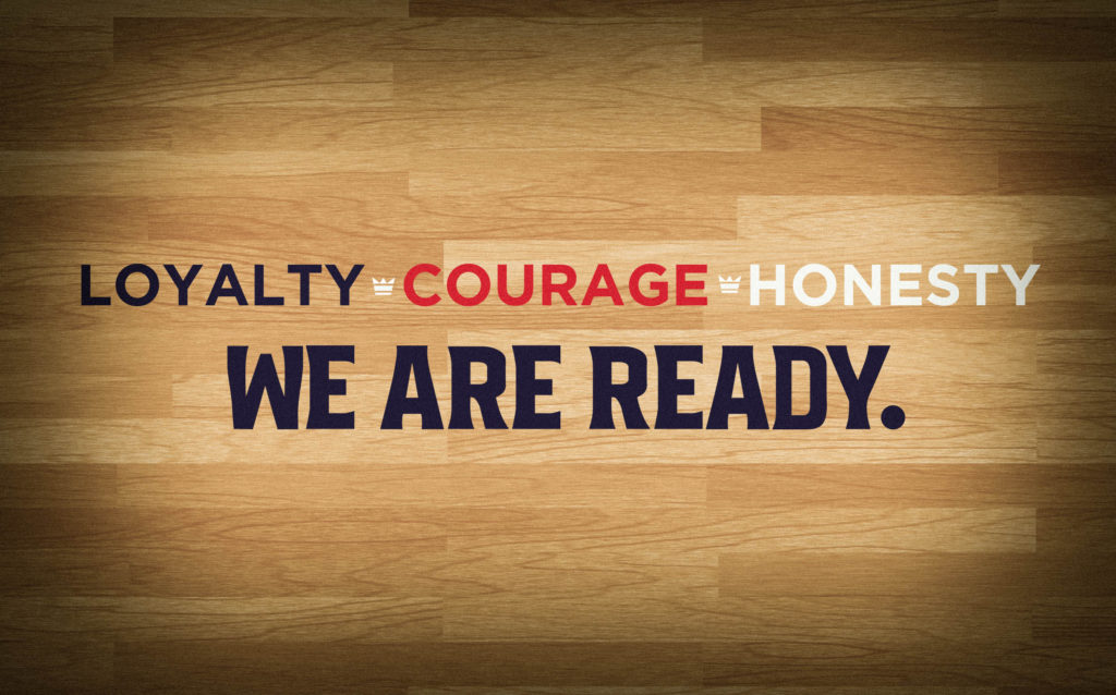
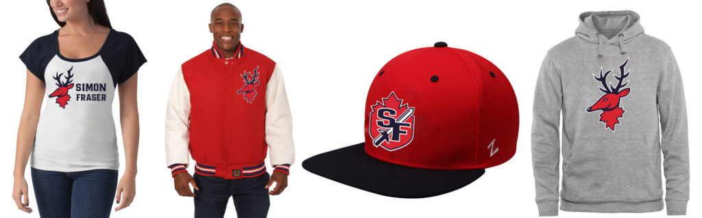
The basic colours remain unchanged, yet have each been given names to honour Lorne Davies’ original vision.
The words ‘Loyalty’, ‘Courage’ and ‘Honesty’ also make up the new slogan for this rebrand of the Clan, and are paired with an English translation of the school’s motto (Nous sommes pret). The new tagline for the team represents the qualities of the athletes and tells the world that ‘we are ready’ for a new era in SFU sports history.
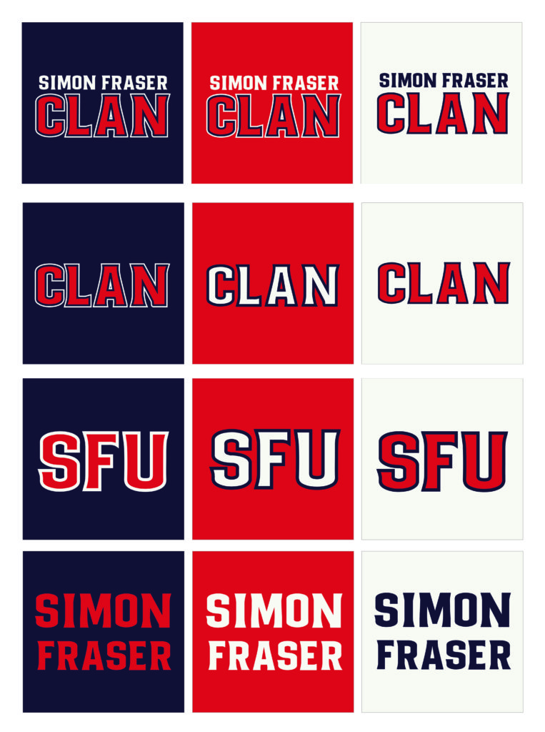
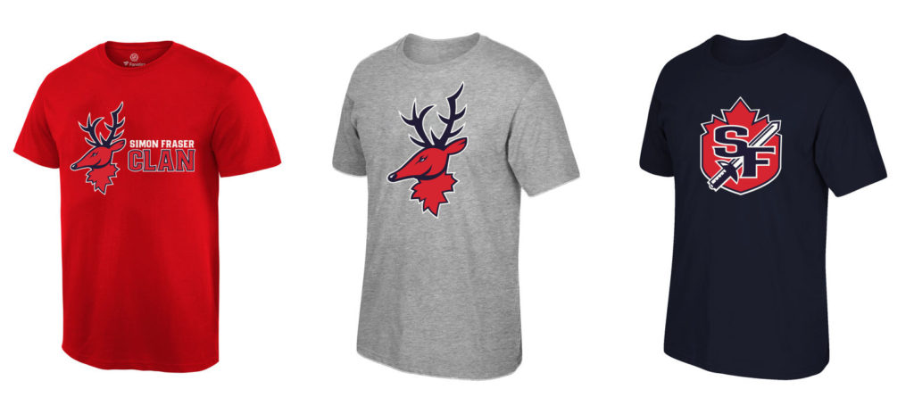
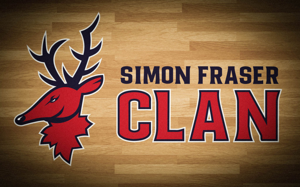
The wordmarks feature a custom font that was designed to exude power and professionalism. It also more prominently features the Clan nickname, which is almost non-existent in the current branding. The ‘Clan’ name is a tribute to the school’s Scottish heritage and is symbolic of the close, familial ties of SFU teammates. While some think the term, Clan, has negative historical connotations, it is not spelled with a ‘K’ and is a unique name with a lot of intrinsic meaning that should be proudly celebrated, not put in the corner.
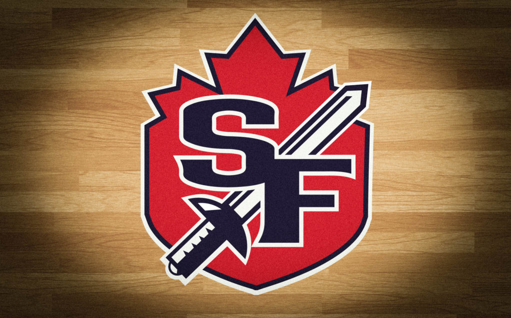
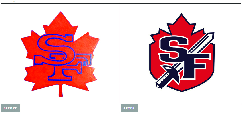
In addition to the primary logo, this new alternate logo further bolsters the rebrand and includes additional ties to SFU’s glory years. The secondary mark is a crest, which was inspired by the Clan’s original look, but makes it unique and more symbolic of SFU instead of a San Francisco football team. A new take on the joined ‘SF’ is featured on a combination of a shield and a maple leaf with a Scottish claymore slashing through the middle.
This new brand for the SFU Clan may help inject new life into an athletics program, that could use a shake up. The Clan can enter a new half-century with a logo that rivals UBC’s Thunderbird, instead of using generic clipart from the 90s. With a new stadium coming and the potential for a top-flight beach volleyball program and even a Division I hockey team on the horizon, the team should take advantage of this opportunity to solidify their identity. SFU needs a new look and these strong, fresh logos and wordmarks would look great on the field (or court), and even better on all the fans buying the merchandise.